
How to approach uniform design with purpose, performance, and personality in mind.
Uniform Design Basics: How to Build Winning Team Apparel
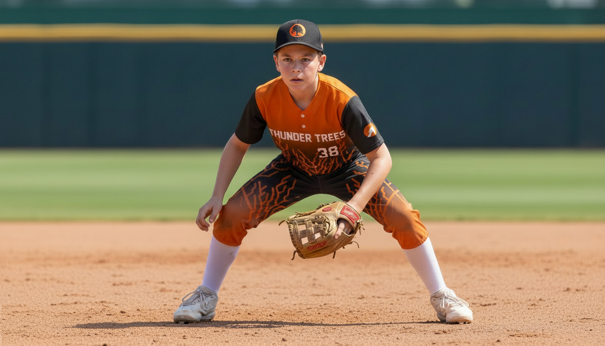
Designing a team uniform is more than picking colors and slapping on a logo—it’s about creating gear that boosts team identity, performance, and pride. A well-designed uniform will not only look great on game day, and in team photos, and on social media; but also communicate who you are as a team and help athletes feel confident every time they step onto the field, court, or pitch.
RELATED READ: Designing the Perfect Custom Team Uniform
🎨 Start with Your Colors and Brand
Team identity is the sum of what your program stands for - It's your culture, your values, your attitude, your style, and your standards.
Choosing the right colors sets the emotional tone of a uniform and reflects your team’s personality. Different colors carry distinct psychological signals:
- Red: energy and aggression
- Blue: trust and stability
- Black: authority and power
- Yellow: vibrancy and enthusiasm
- Green: harmony and order
- Purple: regal and admirable
It’s typically best to stick to one or two primary colors for clarity and cohesion. High contrast between primary and accent colors also improves readability of names and numbers, especially from a distance.
RELATED READ: How Color Psychology Affects Moods, Feelings, and Behaviors
🛠️ Prioritize Practical Design for Performance
Uniforms must function as well as they look. Before choosing details like logos or typography, think about how the apparel will perform:
- Readability: Ensure player numbers and names are large and high-contrast so they’re visible to referees, teammates, and fans.
- Fit: A good fit improves mobility and comfort. Uniforms that are too tight restrict movement; too loose can be distracting.
- Fabric: Athletic uniforms benefit from breathable, moisture-wicking materials that allow freedom of movement and help regulate temperature.
Ensure that you are ordering uniforms that fit the way your players prefer and plan for the full season. Does your team prefer a snug fit or do they like a roomier feel? Are your athletes older and finished growing or is there a chance they might outgrow their sizing before the season ends? Do you play in summer or winter, indoors or outdoors? These are all considerations to help you make sure your uniforms will not only look great, but keep your players feeling their best too.
🧠 Your Logo and Branding Matter
Leadership always starts at the top. Coaches define expectations, values, and culture. Apparel helps reinforce those expectations visually.
When a coach prioritizes well thought out, cohesive gear, it sends a clear message:
- We take this seriously
- We respect the game
- We respect each other
It also creates buy-in. Athletes are more likely to commit to standards when they feel proud of how they represent their program. Just as important, it also builds a support group through family, friends, and fans that feel a part of the team community.
Your logo is the visual centerpiece of your uniform. It should be:
- Memorable and easy to recognize
- Scalable so it looks good whether large on a jersey front or small on a warm-up
- Balanced with other elements like text and trim
Logo placement usually works best on the chest or sleeve, with secondary elements on pants, sleeves, or accessories. Be careful not to overcrowd the design—clarity is king. You don't want your brand to get lost in the noise.
The quality of the image matters during design as well. Make sure you have a high resolution file - preferably a vector file - to ensure that your logo won't be fuzzy or pixelated when blown up on a uniform to a larger size. Not all files are created equal, so it's critical to have the best quality possible.
⚖️ Customization and Balance
Adding player names and numbers fulfills a practical need, but it also fosters connection and pride. Clear, readable fonts in bold styles are ideal for athletic use as they improve visibility for officials and fans no matter where they are during play.
If your team is looking for even more personalization (like embroidered names or custom placement), it’s worth exploring options that maintain the uniform’s overall cohesion without compromising functionality. Consider where on a uniform is a "safe" space that won't be covered by accessories (e.g. socks, belts, or braces) and won't be lost when a jersey is tucked in.
While bold patterns and creative flourishes can make uniforms stand out, less can be more. A clean, balanced design ensures that key elements (like numbers and logos) remain visible and the uniform isn’t overwhelming. However, don't be afraid to have fun with a design to really pop out in people's memory. The key is finding the right balance to express your team's personality, while not distracting from it.
🚫 Common Design Mistakes to Avoid
Even well-intentioned designs can miss the mark. Some pitfalls teams often encounter include:
- Poor logo placement or scaling that makes branding look awkward
- Fonts that are hard to read at a distance
- Fabric choices that sacrifice comfort for style
- Not accounting for how designs will look at a distance
Planning ahead—working with a trusted vendor to get mockups done, testing fabric samples when possible, and involving players or coaches in feedback—will help you avoid costly errors and team disappointment.
🏁 Final Thoughts: Form Meets Function
Great uniform design strikes a balance between performance, identity, aesthetics, and practicality. The goal is to create apparel that players wear with pride, athletes perform in comfortably, and fans recognize instantly.
Whether you’re designing a fresh look for the season or refreshing a classic palette, thoughtful design choices matter. Uniforms are part of a team’s identity—they convey values, boost morale, and make first impressions that last.